Friday, 7 November 2014

Wetlands Masking Technique

Today I am really excited to share a few cards with you that I made yesterday. Now I have a sad truth to share, I ordered the Wetlands stamp stet in early June and the first time I used it was yesterday, that is five months... gulp. To be completely honest I haven't have a chance to stamp as much as I would like, but I am making a conscious effort to change that.
Both card I am sharing today use the wetlands stamp set and a masking technique.
This first card is the goose and sunset card. I started with the oval, straight line, and circle for the sun and sponged to create the sun (Pumpkin Pie and Tangerine Tango) and the sunset glow (Crushed Curry and So Saffron) against the horizon, then I finished off the sky with Pool Party. For the water I kept the oval mask and moved the horizon mask and sponged with Pool Party, Coastal Cabana, and Island Indigo. 
 After the sponging and removing the masks I stamped the goose, greeting, and reeds in Early Espresso. I added a few masks at the bottom of the card stock as I still wanted the image to stay close to the oval and the reeds would have come too low for my preference. 
I coloured the Goose with Soft Seude, Crumb Cake, and Early Espresso. I also added a few details to the his feathers with a white gel pen. I think he looks pretty good.

This second card I actually made first. Again it uses the Wetlands stamp set and sponging with masks. I used 3 masks for this card, one at the top and bottom of the card from torn paper, and one for the horizon. I started again with the sky and used Pool Party, Coastal Cabana, and Island Indigo. 
 After the Sky I added the sand for the beach. For this I used Crumb Cake and Soft Suede and I also added some water with Pool Party and Coastal Cabana. Next I stamped the reeds in Wild Wasabi and Garden Green.
 Finally I stamped the Birds and the greeting in Early Espresso and removed the masks and mounted it on a whisper white card base.

Thanks for stopping by today. Please feel free to let me know what you think of this project.
-Jill

Tuesday, 14 October 2014

Fall Birthday

Hello there,
I have a card to show you that I made for the As You See it Challenge #057. The theme for this week is Autumn so I used rich fall colours and some ink and paper distressing. I went with a birthday greeting and added some twine to compliment the look. The DSP is some old stock I had on hand and the card base was originally supposed to be for another card, but it wasn't the size I wanted. What do you think?


  Here are some close-up photos of the details:


Here is the inspiration for the card:
AYSIChallenge057

Sunday, 7 September 2014

Map out the Birthday

I am excited to share a card I made today. I am very happy with it. I cracked open a stamp set I just ordered, World Map and had fun making this vintage distressed map/travel card. I just love this background stamp. It is really versatile and totally great for masculine cards too.


I did a lot of distressing by tearing paper and using my bone folder, Distressing Tool, Gorgeous Grunge stamp set, and aqua painter. I wanted an aged and weathered look so I even folded up and rolled some corners. I am very happy with this card and love how it turned out; and my husband and inlaws -who were visiting this weekend, were also impressed.

Here are some close ups of the details on the card.


Here is the sketch and inspiration for this card:
 AYSIChallenge052

Thanks for stopping by,
-Jill

Wednesday, 16 July 2014

Feathers for a Friend

Hello creative friends, I hope you are doing well. I have another card to show you. This one is simple and cute, or as the challenge says, clean and graphic; even though the ink splatter makes it look intentionally messy. This card is for a dear friend of mine who I miss very much since moving and I just want to remind her that I am always thinking of her because she is wonderful!
This Card is for the Card Concept Challenege #14 featuring White, Black, Red and Teal. It uses the Feather and Ink Blot new stamps I ordered a few weeks ago. (I really ordered that stamp set only for the feather as Gorgeous Grunge has ink blot stamps.) I love how this card turned out and even though it is simple I think it is vibrant. What do you think?

 Here is a close-up of the Feather 'pen' coloured to look as if it was dipped in a ink pot:

Here is the Insiration and colour combo for this card:

Thanks for stopping by,
-Jill

VW Cards

Hello there friends here are some of those cards I was mentioning that I made and I want to share with you. You probably noticed that the stamp set I used for the focal image is one of the new ones I just got from 123stitch. I live that site, so many cute things and good deals.

Anyways, onto the cards. This first one is for my cousin Carolyn who we stayed with for a month while waiting to get into our house. Carolyn drives an old yellow bug so this was perfect for her.
I used the sketch Challenge from My Favorite Things #185.

Here is a close-up of the VW Beetle. I think the speech bubble makes it seem like Herbie.

You can see the Sketch for this Card here:
MFTWSC185

This next card I made for my husband to congratulate him on working at his new job. (He started back in May and I gave him a card then but his gift just came in so I need a card to go with that.) It uses the same VW bug stamp set from DeepRed as He has a 1961 Orange VW Beetle and is a VW car enthusiast. I used some stamps from past Paper Pumpkin Kits, Petite Pairs and Gorgeous Grunge on this card and I think adding the Cherry Cobbler ink and CS helped make the colour scheme more masculine. 
For this card I used the layout from Paper Craft Crew Card Sketch #102.

Here is a close-up of the Beetle. I fussy cut this one out and coloured using my blender pens.

Here is the sketch I used for this card.
PCCCS072-102-011

News, I'm back

Hello friends, I just wanted to share a few things that I found exciting:
  1. I just signed up as a Stampin' UP! Demonstrator again. (WhooHoo)
  2. I received a shipment of cute stamps from 123 Stitch
  3. I have moved into my beautiful home in Alberta, and my craft room is set up.
  4. I made some cards I would like to share with you in my upcoming posts, so stay tuned.


Ombre Dandelions Painting

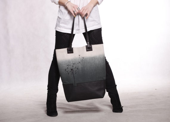
So I meant to post his weeks ago as this painting was done by the middle of June, but c'est la vie. I made this canvas art for my sister-in-law's birthday in June and I thought it would be a good thing to make her something for the home she and my brother-in-law just bought. It's a black white and grey ombre and I like how it turned out. the hardest part was mixing four different grey's to give the right effect.

This canvas art piece was inspired by my last post and this bag, available on Etsy.

Large canvas leather tote bag. Black ombre tote with embroidered dandelion. Cotton/leather beach shopping bag.

Thank you for checking out my blog today,
-Jill

Tuesday, 17 June 2014

Dwell on Dreams

Hello fellow crafty people. This month has been a craft hiatus for me, but I am trying to stay creative. The hiatus is due to my recent move to Alberta. We are currently living in the travel trailer of our generous cousins with all our belongings in our moving trailer for the last 4 weeks. However we did just get our keys and will be moving into our own place soon.

When I packed our house I packed up all my stamping and paper crafting goodies and set aside two small boxes of painting supplies and canvases; these boxes came with us in the truck along with anything we would need for living over the next month. So I have been expanding my creative horizons into paining and wanted to share with you my newest project.


One of my favorite novel series is Harry Potter and I love the quotes from that series; especially those from Albus Dumbledore. One he makes in the first novel is one that I like very much, it is said in the scene of the Mirror of Erised. Of the mirror Dumbledore says, "This mirror will give us neither knowledge or truth. Men have wasted away before it, not knowing if what they have seen is real, or even possible...  It does not do to dwell on dreams and forget to live, remember that." (You can find a video clip of the quote in context here.)
after I settled on this quote for my first art piece I knew what I anted it to look like based off inspiration from a pin on Pinterest  that I totally fell in love with. I loved the ombre blue  that went over the text and knew it would work well for my chosen quote. I like the not so straight lines of the ombre I think it holds true for the look I was going for: 'Day time into night.' I used acrylic paint, chipboard letters and a wrapped canvas for this project, let me know what you think.
Here is another close-up on the quote section of the canvas:


Have a great day and I hope I may have inspired you to get creative too.

Thanks for checking out my project,
-Jill

Thursday, 8 May 2014

Rainbow Thanks from Paper Pumpkin

When I first got this Paper Pumpkin Kit I was excited for it: adorable gold envelope liners, supplies to make 8 cards (2 designs), and I loved the wood cutouts, but the card design was a bit simple for me (and I struggle with simple cards). I have been paining and water colouring lately and I was surprised with how well it worked on the wood. I finished it off with a few home-made enamel dots I baked in the oven using this video tutorial. The colour scheme I used was Whisper White, Basic Black, Real Red, Pumpkin Pie, Daffodil Delight, Old Olive, Burmuta Bay and Night of Navy. I used one of the wood pieces from the Paper Pumpkin kits for the sentiment and water colored it with an aqua painter. I made this card for the following card challenges: Addicted to CAS #37 (Grunge) and Seize the Sketch #19.

Here is the sketch and colour combo used for this card.
 

Thanks for checking out my creation,
-Jill

Congrats Rainbow

Hey there, this card I am sharing today is for a few card challenges: Addicted to CAS #37 (Grunge) and Paper Craft Crew Sketch #91. I love the speech bubble layout but I'm not sure how I feel about the arrows. What do you think? The colours I used are Whisper White, Basic Black, Real Red, Pumpkin Pie, Daffodil Delight, Old Olive, Burmuta Bay and Night of Navy. I used one of the wood pieces from the Paper Pumpkin kits for the sentiment and water colored it with an aqua painter.

This is the sketch and colour combo I used for the card.
 Paper Craft Crew Card Sketch #91

Thanks for checking out my card,
-Jill

Simple Shades of Purple

I really like this card sketch from Clean&Simple #290 It is Clean and Simple but also cute. I decide to use it along with the colour combo from The Card Concept #9 to challenge myself to make a card as I figured the two fit naturally together. I used Whisper White, Wisteria Wonder, Perfect Plum, Elegant Eggplant and Concord Crush to make this card. I used the Flower Shop and Yippie-Skippie Stamp Sets to create the look and I went for a long and skinny card shape to tie it all together. What do you think?

Here is the Colour Combo and Sketch for this Card.
 
This will be one of the last challenegs I do for a few weeks while my husband and I pack up and move from the Okanagan to Alberta.
Thanks for Stopping by,
-Jill

Wednesday, 23 April 2014

Always Friends

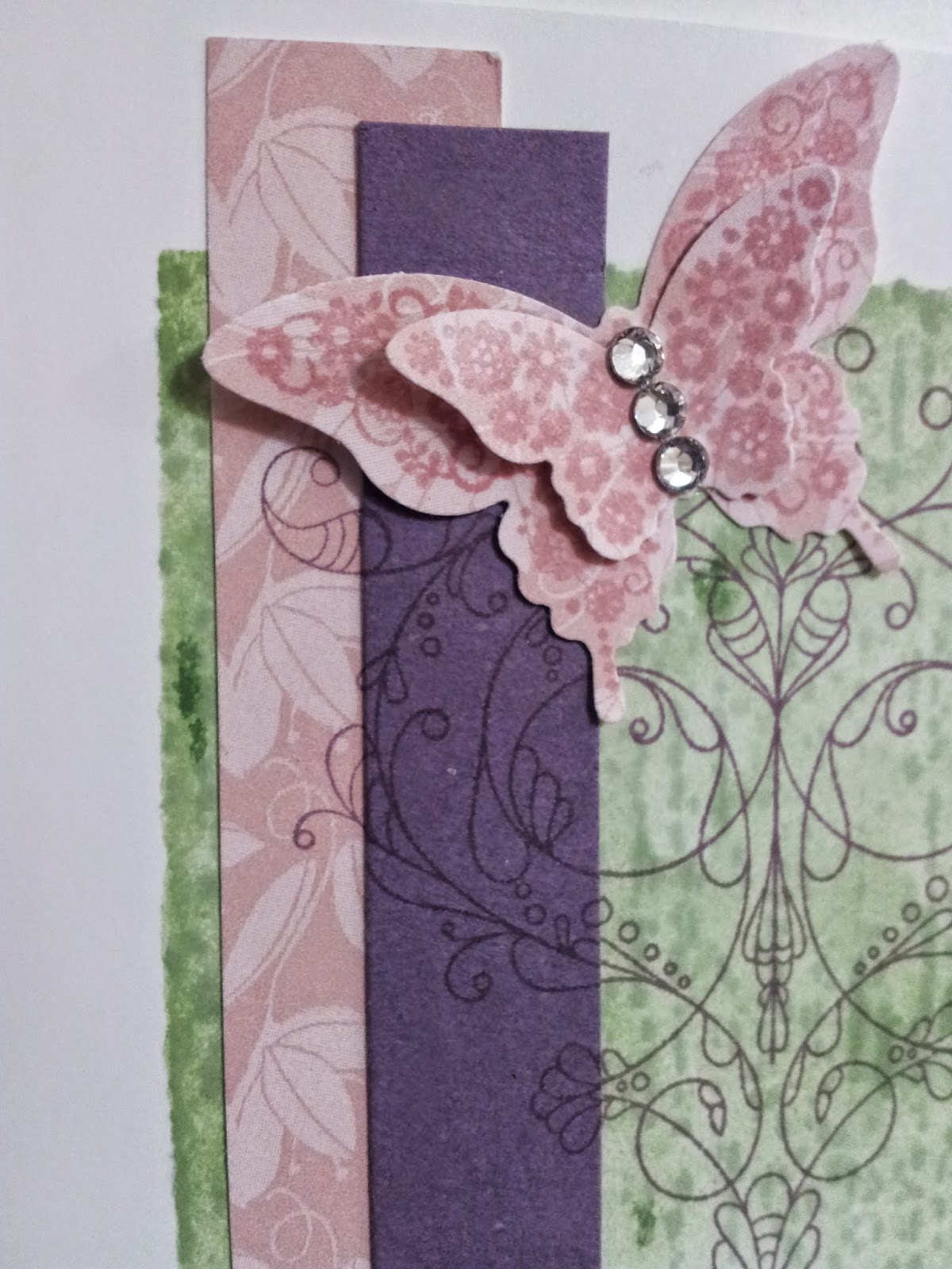
This card is for a friend at work who just got back from a wonderful holiday to welcome her home. I love the CAS design as it is still detailed and feminine. I made this card for participation in the following challenges: Less is More #168 (makes me Smile), The Pink Elephant #247 (water colour), My Favorite Things Sketch #173, CASology #92 (Garden) and Color Throwdown #289. I used a block inked in Wild Wasabi then spritzed with water for a watercoloured technique. I stamped the butterflies on retired Blushing Bride DSP ans used the same paper for the banner. I stamped the Always image on the base and on both banners and then lined everything up. I finished it all off with a simple sentiment and 3 rhinestones. This card feels for Spring like and like a butterfly is right on the post of a garden fence. (I know there is no fence in this card but the banners feel like posts a bit and the watercoloured Wild Wasabi patch looks like a patch of Grass) Do you like it?


Here is a close-up of the layered technique on the banners that I used on this card (with the always Perfect Plum flourish).

Here is the Colour Combo and Sketch for this card.

    MFTWSC173

Thanks for hanging out,
-Jill

A Dynamic Elegant Wedding Card

Hello, Today I am sharing a wedding card I made for a friend who's wedding I am going to miss. :( Sad but true. I was inspired by Dynamic Duos #99 (Rich Razzleberry and Basic Black), and Sisterhood of Snarky Stampers #6 (embellishments), and Sketch Saturday #306. I wanted to use a lot of bling and sparkle so I opted for a shaker card with TONS of gold glitter, Gold foil, Gold Embossing, and Rich Razzleberry Glimmer brads. I used the Always Stamp Set for a elegant Background and added more texture with the Razzleberry ribbon. Let me know what you think.

Here is a close-up of the details.

Here is the Sketch and Colour Combo for this card.
  

Thanks for looking,
-Jill

LinkWithin

You May also like: