Sunday 31 May 2015

CAS Filmstrip Shaker

Hello friends, 
Today I am participating in three challenges to make this cute CAS card. The challenges are a tic-tac-toe challenge from The Paper Players 247, a colour combo from the Color Throwdown 344, and a sketch from As You See It Challenge #089. I combined these three challenges to create the card below, and had a bunch of fun doing it. 

For the PP247 tic-tac-toe I chose the right column which is "sequins, a flower, and any shade of yellow," I paired this with the colour combo of wild wasabi, whisper white, so saffron (for the yellow) and pink pirouette inspired by CTCC344. It all worked out nicely with the concept of a shaker card and the sketch from AYSI089.

Here is a close-up of the flower and the shaker.

Here is the inspiration theme, colour combo and sketch for this card.
  AYSIChallenge089

Thanks for stopping by,
Stay creative my darlings.

Wednesday 20 May 2015

A Bright 26th

Happy Wednesday internet friends, 
Today I want to share an adorable birthday card I made for one of my best friends for her 26th Birthday this year. To make this card I used inspiration from Colour Me Creative Challenge #72 and Paper Craft Crew sketch #145. A cute layout and a fabulous color combo.


The colours for this card are Bermuda Bay, Pear Pizzazz, Daffodil Delight, and Whisper White. I took the provided sketch and rotated it to get this look.
To make this card I first spritzed the front of a 6x6 Whisper White card base with Pear Pizzazz mixed with rubbing alcohol. I added a piece of retired DSP (only now realizing it it Coastal Cabana... oops) layered with some retired So Saffron Grosgrain ribbon. I also added one piece of Daffodil Delight stamped with Gorgeous Grunge, and one piece of Daffodil Delight with Gold Washi tape.
I used a piece of Pear Pizzazz in the Modern Label Shape and layered it with the chalk talk framelits.
I stamped the sentiment on Whisper White CS and coloured it in with Bermuda Bay and then layered it with a piece of vellum, both were cut with the tag from the chalk talk framelits. I also added a clip and a simply pressed clay button embellished with white bakers twine.
To make the butterfly I sponged a piece of Whisper White with Bermuda Bay, Pear Pizzazz, and Daffodil Delight. I then cut out the butterfly with my Silhouette Cameo. I added some sparkle with the retired smooch paint and an old sponge. This card is beautiful (but quite bulky when I mail it), I hope my bestie appreciates it when she gets it next month.

Here is a close-up of some of the details of the card. 
     

Here is the colour combo and sketch for this card:
 Paper Craft Crew Card Sketch 145. #stampinup #papercraftcrew

Thank you for checking in today, 
Stay creative my Darlings, 
-Jill

The Word Unto Thee

Hello Crafters,
Today I spent a nice chunk of time in my craft room (about 4 hours) to complete a few challenge cards. Today I am participating in As You See It Challenge #87, Color Throwdown #343, and Word Art Wednesday CHallenge #184. Word Art Wednesday's Challenge provided this great sentiment from Deuteronomy 30:14, which says "But the word is very nigh unto thee, in thy mouth, and in thy heart, that thou mayest do it." This sentiment will make a nice card for both my grandparents in-law. Here is the card I made with these challenges in mind. 

To make the card I used Bermuda Bay, Tempting Turquoise, Chocolate Chip, Early Espresso, Daffodil Delight and Whisper White. I used the SU Honeycomb Embossing folder stamped with temping turquoise and the brayer to transfer the pattern to the card stock, and kept rolling it over and over to make my own DSP. 
I then layered on the greeting from Word Art Wednesday and a Daffodil CS banner.
The ribbon is not SU, and the burlap is naturally crumb cake coloured but I dyed it with Early Espresso re-inker and rubbing alcohol.
The heart speach bubble is from an old Paper Pumpkin kit. I stamped it in Burmuda Bay ink on Bermuda Bay CS and then coloured in the heart with  a white gel pen. I added some last details with mini pearls I coloured yellow and brown markers.

Here are close-ups on the card's details.
 

Here are the sketch, inspiration, and colors for this card:
AYSIChallenge087 

Thanks for stopping by today, 
Stay creative my darlings,
-Jill

Sunflower Restful Days

Hello Crafters,
Today I spent a nice chunk of time in my craft room (about 4 hours) to complete a few challenge cards. Today I am participating in the As You See It Challenge #87 and Color Throwdown #343 challenges. I love the light and bring feeling of the get well card, it would perk me right up!


To make the card I used Bermuda Bay, Tempting Turquoise, Chocolate Chip, Early Espresso, Daffodil Delight and Whisper White. I used the SU Honeycomb Embossing folder stamped with temping turquoise and the brayer to transfer the pattern to the card stock. I then added the greeting from "Thoughts and Prayers" and cut a couple slits with my paper trimmer. Then I threaded the Daffodil CS though these slits.
The ribbon is not SU, and the burlap is naturally crumb cake coloured but I dyed it with re-inker and rubbing alcohol. The flower is the Pansy Punch and The Petite Flower Punch  layered. After I punched out the pansies I used my scissors to trim them up quite a bit. (they actually looked so sad alone but much better after they were layered together. 

Here is a close-up of the details of the card:
  

Here are the sketch and colors for this card:
AYSIChallenge087 

Thanks for stopping by today, 
Stay creative my darlings,
-Jill

Monday 18 May 2015

Featured Artist AYSIC#086

Thank you to the design team at the As You See It Challenge blog for selecting my card as a winner for AYSIC#086. I feel very honored to be selected as this week's featured artist. There were some beautiful entries, congrats to all the other participating artists, your work was great.

AYSISnaps

Here is the card and original blog post.

Thanks for the recognition. 
Stay creative my friends!
-Jill

Thursday 14 May 2015

Painting Practice

I have started trying my hand at canvas art mixed with vinyl lettering masking. Here are three projects I made recently.

Before Christmas 2014 I made this one. This first experiment with spay paint and canvas taught me many lessons about paint thickness and excess moisture but it still looks vintage and festive. I love the Dr. Seuss phrase from 'How the Grinch stole Christmas.' I went over some of the not so nice parts with white acrylic paint and antiqued it up with some brown acrylic paint and sanding.
I ended up gifting this one in the Work Christmas Gift exchange game and everyone was very excited about it and the Pillows I made that went with it.

For this other Christmas project I had something more like this big Merry & Bright sign in mind but the small one is cute too. I love the gold look.


Here it is displayed on our fireplace mantel in the top right of the photo.

This project I used inspiration from a few different projects I saw on Pinterest. I wanted lights like Stars or the Merry & Bright inspiration, an HP quote, and different colours.
The quote I had already selected was "Happiness can be found even in the darkest times if one only remembers to turn on the light" spoken by Professor Albus Dumbledore as he addresses the pupils of Hogwarts in the Great Hall at the start of the film The Prisoner Of Azkaban. I thought this quote would be well suited to a lighted canvas project as it even says to 'turn on the light' and I like puns like that. (I am Lame, I know.) So i searched it on Pintrest and found this EXACTLY the project I was looking for. It was perfect, All I needed to do was make it my own.


I printed out the letters with my cameo and adhered them over the white canvas. I then spray pained over the letters with black and added blue acrylic paint with a sponge. After it had dried I removed the vinyl letters and voila!

The next step was to add the lights, I poked holes in the canvas with a tack at "random" intervals to create stars then I pushed the lights through those holes.  I secured them on the back with Duct Tape, it's not pretty but it works.

I am really happy with how this turned out and I use it as a night light.

Thanks for stopping by today,
Stay creative my darlings!
-Jill

My Nerdy Clothing Creations

After making my husband a t-shirt (as one of my first Silhouette projects) and then some fun Christmas presents for my Hubby and his dad and brother I couldn't help but make some nerd gear for myself. 

I started out making a Harry Potter shirt with this sweet Harry Potter Spells Lighting Bolt Image I purchased with the Hogwarts House Crests in my other post. (Can you tell that I am a big HP fan yet?) This design took FOREVER to weed, (blarg) and that really sucked cause I learned after the iron on process that I was making a mistake in how I was Ironing on the Vinyl and now it is only an 'around the house' shirt cause I burned wax into it.. Oh well, at least the mistake taught me lessons I have learned from.


I made a great Sherlock T-shirt inspired by this one on Etsy.  I got the Silhouettes of Sherlock and Dr. Watson here. This whole shirt was done with Heat Transfer Vinyl.


 My Dr. Who Shirt was also exciting to make. I used a Tardis, the text "The Doctor" and the heads of Dr.'s 10 and 11. The Tardis was painted on and all the rest was heat transfer Vinyl. 


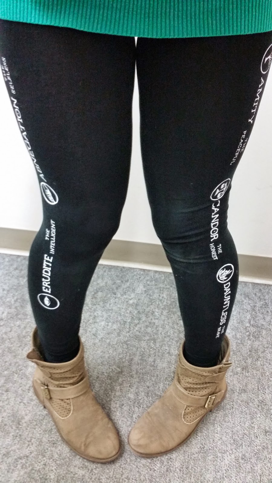
Next I tried a pair of tights.
I recently Read the Divergent Series, and while I am not the biggest fan of how Veronica Roth ended that series (Seriously why do that to a readership) or her changing writing style. Yet I did very much enjoy the story. I thought the factions were actually quite a cool idea and I decided to add them to a pair or tights with Iron-On Heat Transfer Vinyl. If I did this again though I would use fabric paint as I move a lot and my tights are quite stretchy and I would prefer not to re-set the vinyl every second wash.
   

Anyways I am quite happy with these creations and will soon be trying a few more designs. (My husband has offered "my services" to make a shirt for a Volkswagen friend of his.)

Wednesday 13 May 2015

Watermelon Birthday

Hello friends,
Today I wanted to create a card and participate in a card challenge or two. Today's card is an entry in two card challenges, the first one is a sketch from As You See It Challenge #86, and the second is a colour combo from Colour Me CMCC #71. I liked the light and fun watermelon color combo and the cute playful sketch.


The only thing I couldn't decide on was weather I preferred the black or white text on the "Happy Birthday" greeting, I think both are nice, The white is softer and feminine and the black is more of the watermelon feeling in the inspiration photo. 

To make this card I used Melon Mambo, Pear Pizzazz, Pink Pirouette, Basic Grey, Whisper White, and Silver Metallic for the color combo. I stamped the Dictionary Background on the Melon Mambo CS, Layered the Pink Pirouette and Melon Mambo on top of the Whisper White and then added stitching with my sewing machine. This piece was popped up using dimensionals.
I then added the strip of Basic Grey CS from my scraps stash, tied some metallic silver bakers twine around the front of the card, added some itty bitty pearls and the focal greeting.
For the focal greeting I used Yippee-Skippee and Banner Greetings (Hostess) stamp sets. The "Yippee-Skippee" was stampeds with Pear Pizzazz ink on Pear Pizzazz CS and the "Happy Birthday" was stamped with Pear Pizzazz ink on Whisper White CS (in the Black version I also went over the text with a fine tip marker). I also flagged the greetings by bending them with my bone folder to make them pop. The flower was made with three punched out flowers using the petite petals punch and topped off with a large pearl. Both greetings and the flower were then layered on a piece of silver metallic paper punched with the decorative label punch.

 Here is a close -up of the details in both the black and white versions. Which do you prefer, the black or white?
  

Here are the two challenges that inspired this card.
AYSIChallenge086 

Thanks for checking me out today. 
Be creative my friends.
-Jill

LinkWithin

You May also like: